Creating clarity amidst confusion

GOALS, CHALLENGES & OBJECTIVES
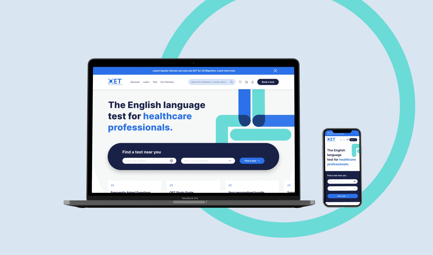
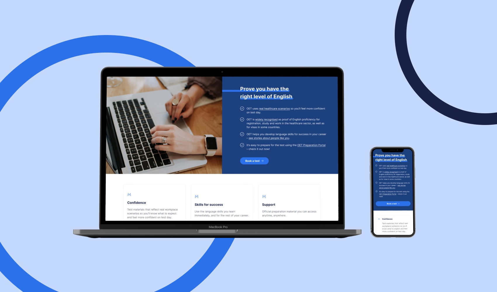
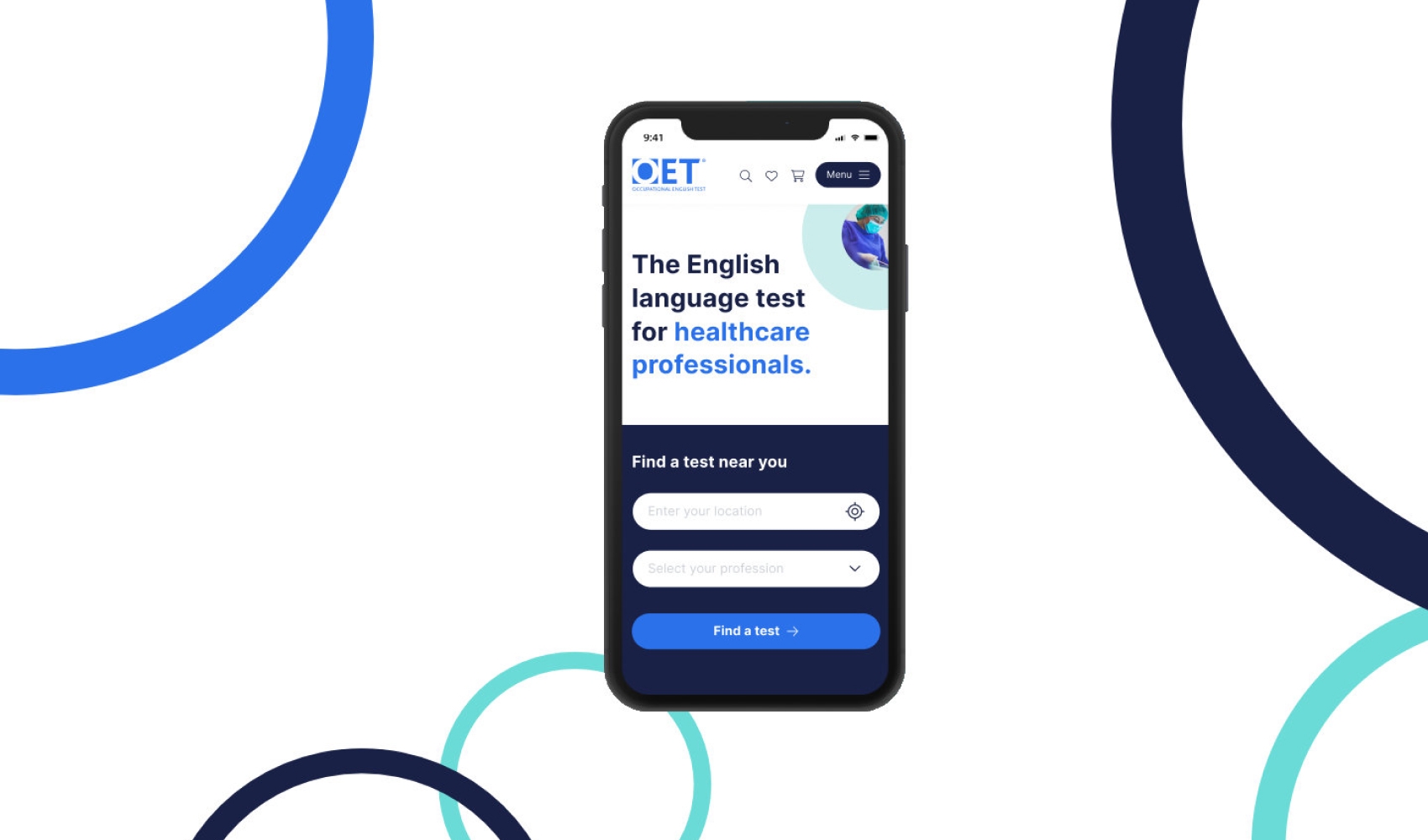
With increasing competition in the market for occupational English testing, OET’s main goal was to maintain its role as market leader in the healthcare sector.
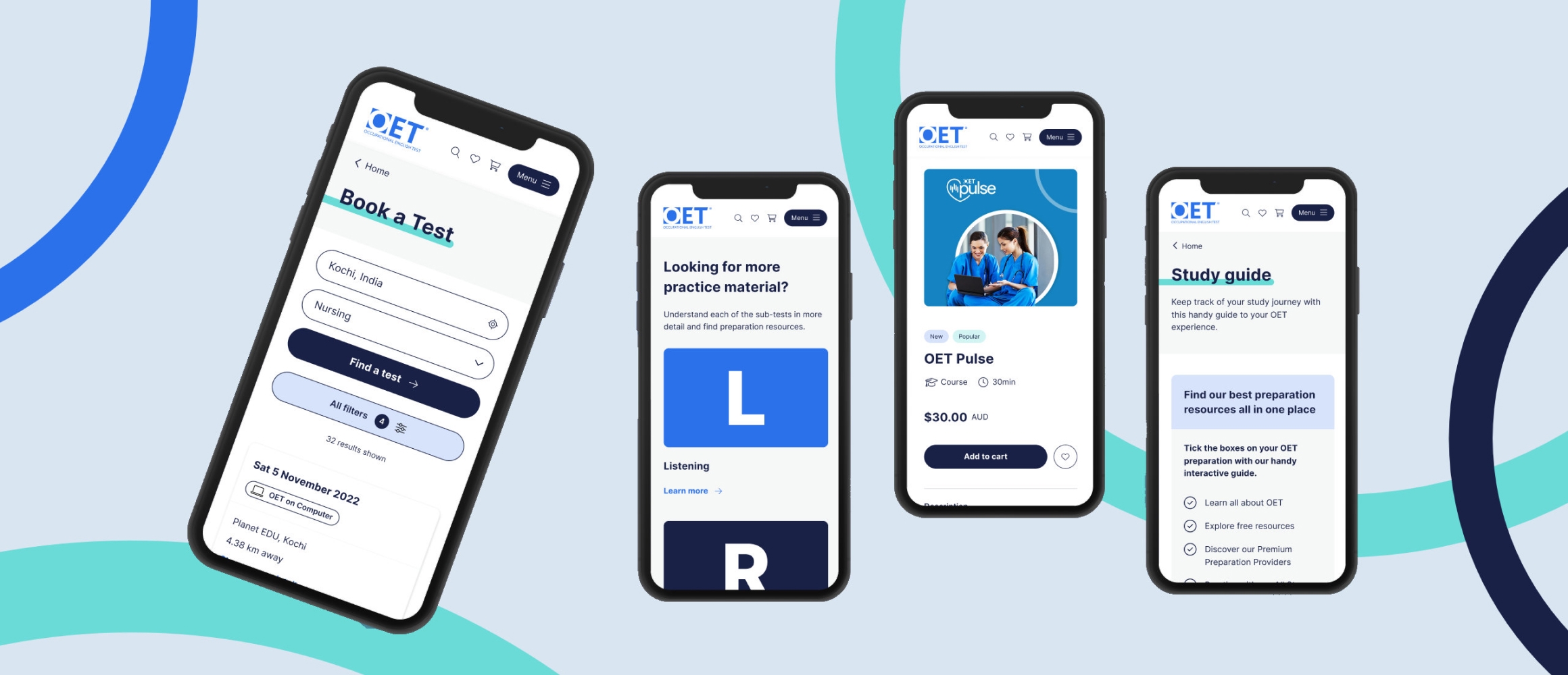
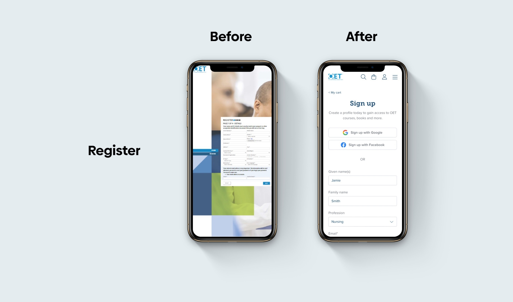
In developing a new sign-in and check-out, OET’s objective was to create a platform that would serve as a basis for the launch of new products.
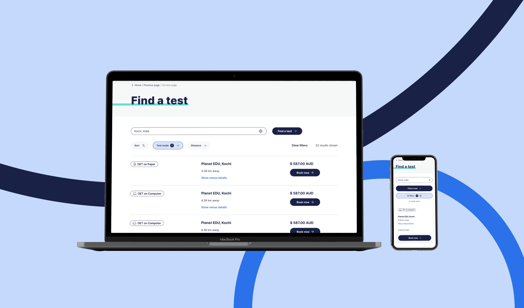
The main challenge was to create a consistent, universal and quick sign-up and check-out process that was
- subject to complex data input requirements, and
- just as intuitive to use for a fully qualified surgeon from India as it was for a nurse from the Philippines.
DISCOVERY
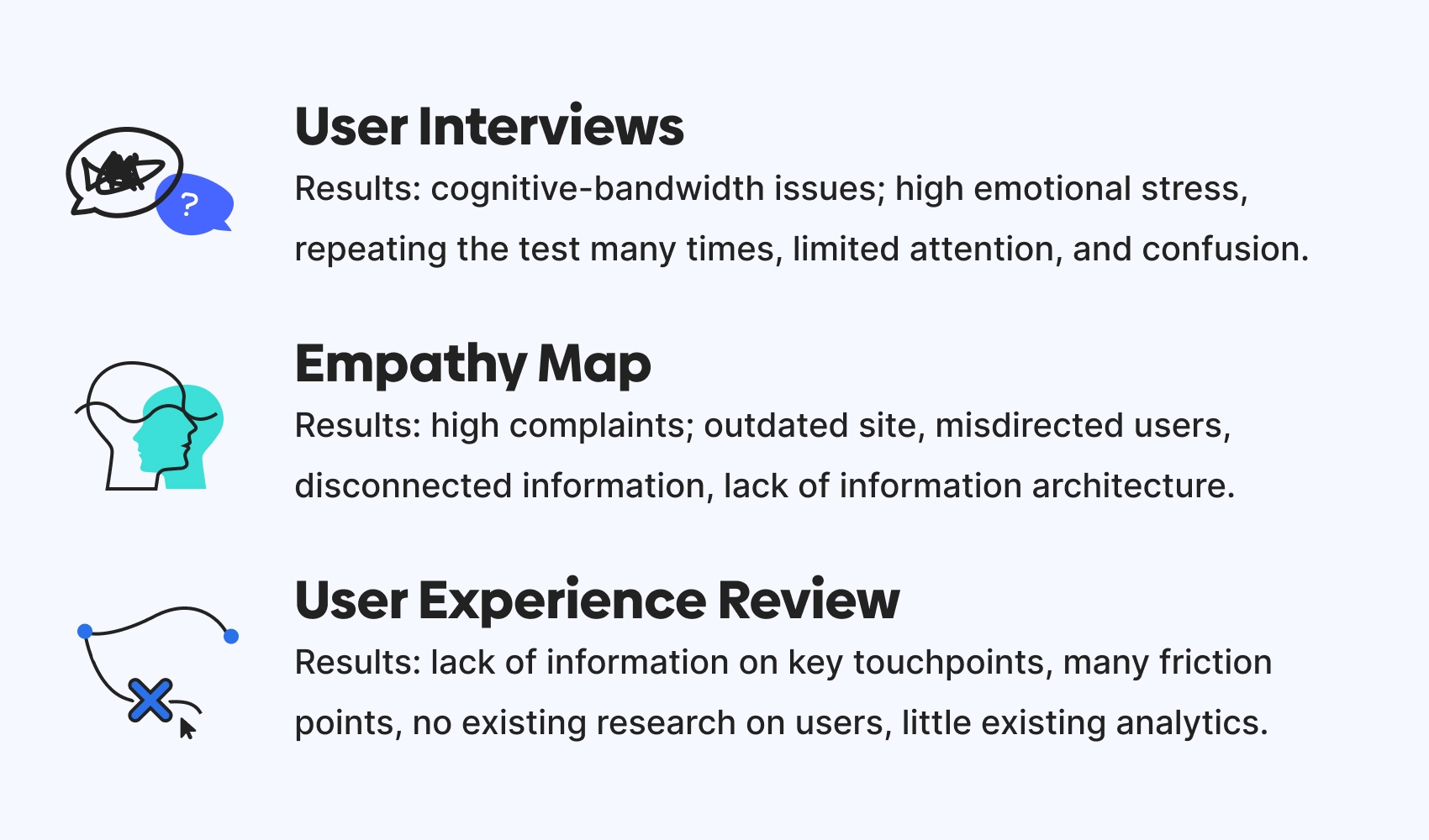
Existing data: We consolidated and analysed existing data about user behaviour collected by HotJar, product performance (eg time spent in sign-up and check-out flow, bounce rates, returning users) collected from GoogleAnalytics, as well as customer experience reported by the customer service team to inform our design choices.
User interviews and surveys: To identify types of users (ie personas and scenarios) as well as respective pain points in the user journey, we ran in-depth user interviews as well as surveys.
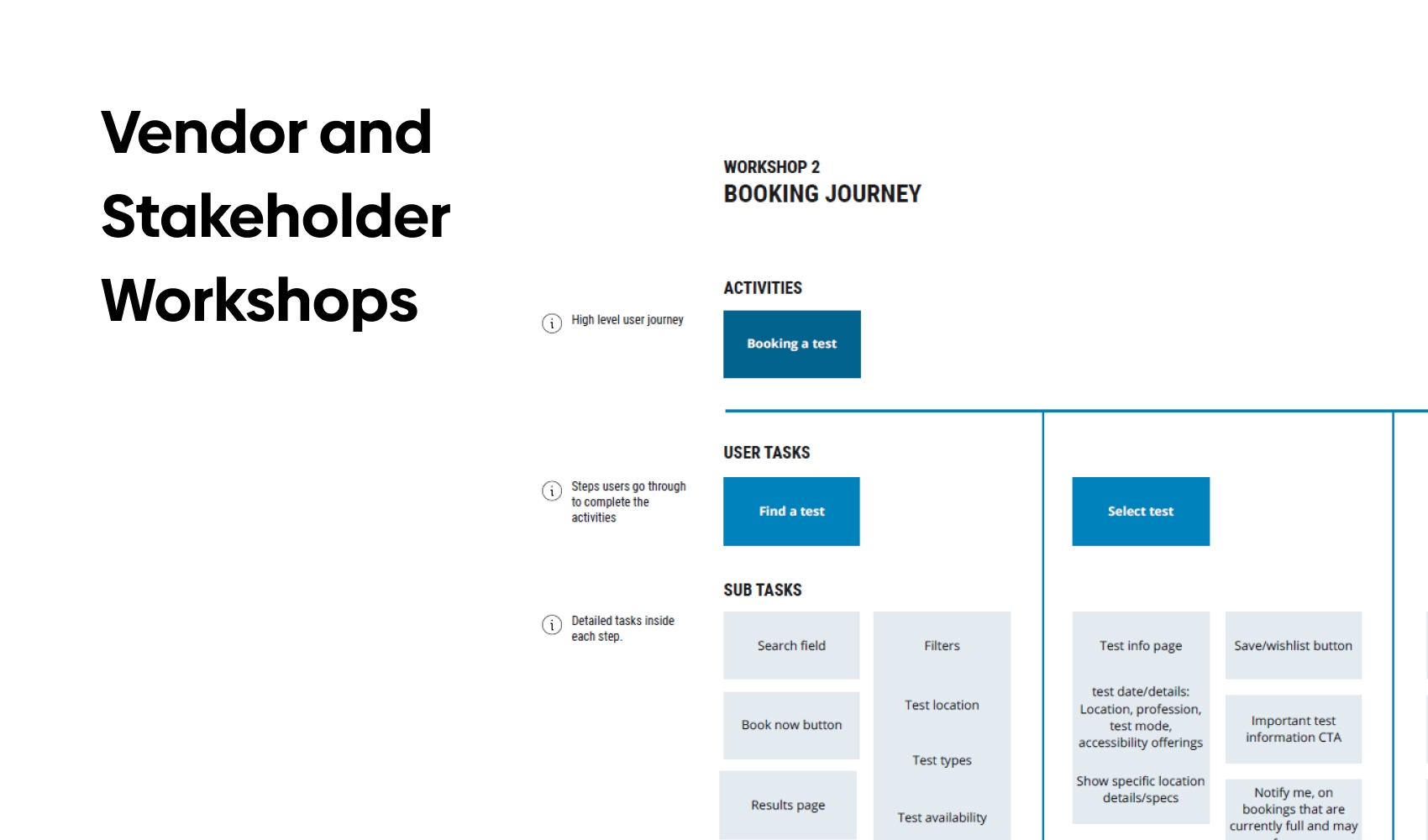
Stakeholder interviews and workshops: To identify business-side frictions and understand existing processes, we also interviewed stakeholders across departments (eg language experts, product owners and the design team, content writers).
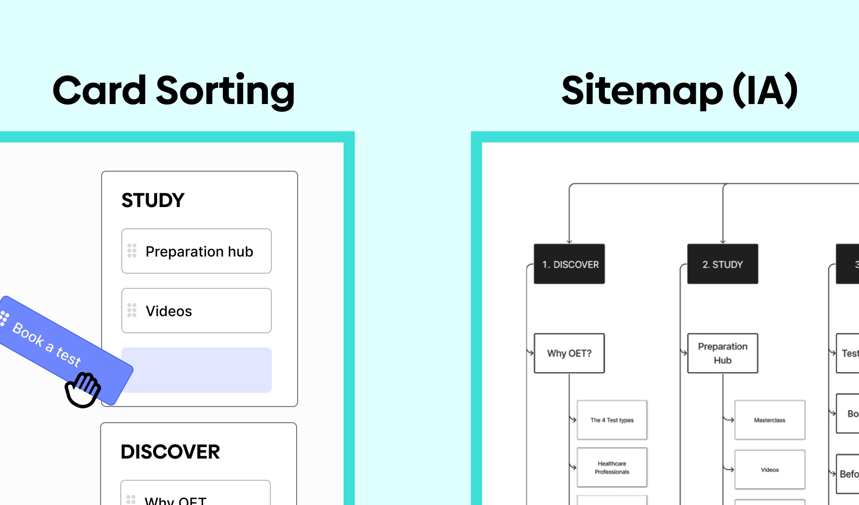
Card sorting: Signing up for a language test requires a number of mandatory input steps (eg ID verification, address verification, test times and location, professional background, payment options) and the process can become confusing quickly. We ran a card sorting exercise with ca. 60 users. Our goal was to learn about how input steps and associated information needed to be laid out to achieve an intuitive user experience.
Usability Testing: Once we had synthesised results from the previous discovery activities, we generated a prototype and confirmed our design choices through usability testing.
PROBLEMS SOLVED
As the occupational language test was a stepping stone for many of OET’s customers to relocate and pursue a better life overseas, discovery proved more difficult than expected. Frequently, customers were already in a heightened emotional state due to life pressures, financial difficulty and the stress of passing a test that would be expensive to repeat. Thus, non-anonymous forms of user research, such as interviews, proved to be problematic. Candidates were worried that negative feedback would affect their language test. In some cultures, it is also perceived as inappropriate to give negative feedback. We solved this by switching from user interviews to anonymised surveys.
Initially, OET had contracted us to rework their sign-in and check-out only. As the project progressed, the scope increased to include a major redesign of their exiting website as well as additional products, like a platform to match potential employers with language test graduates. To ensure a quick turnaround, OET had brought on a number of different vendors (eg local IT infrastructure, cloud infrastructure, marketing specialists, developers). This was a major disruption to our exiting project plan and timeline, as deliverables needed to be moved forward such that other vendors could start work. We solved this by establishing good communication with all parties, reworking and reprioritising tasks, developing a UI component library, creating a roadmap and taking the lead in organising collaborations.
This was also a challenge internally. Due to the sudden need to bring more staff onto the project and a reconfiguration of roles and responsibilities, stress levels and confusion increased for the more junior designers on the team. We solved this by increasing mentoring efforts, ensured more senior designers were available on-demand, introduced design jams and other fun activities to contribute to a positive work environment.
OUTCOMES AND ACHIEVEMENTS
- Brought the website in line with current UX, UI and information architecture standards.
- Implemented SEO and accessibility best practices on website.
- Developed future-proof design to ensure additional products and features can be added smoothly.
- Brought project back on track after major disruption.
- Overall high client satisfaction.
RESPONSIBILITIES
I worked on this project as the Lead Product Designer. My main areas of responsibility were:
- UX (research design and analysis, information architecture, UX advocacy and consultancy, quality assurance)
- Design (lo-fi and hi-fi, wireframes, prototyping, UI component library)
- Management (internal and external stakeholder management, sprint planning and prioritisation, project management)
- Mentoring & Leadership (training, team lead, mentoring)