Blank canvas and rapid prototyping

GOALS, CHALLENGES & OBJECTIVES
divit are a group of business professionals who approached me with a fintech product idea, but lacked a way to bring it to life. The goal was to create a prototype of the product to convince investors and attract commitment from airlines.
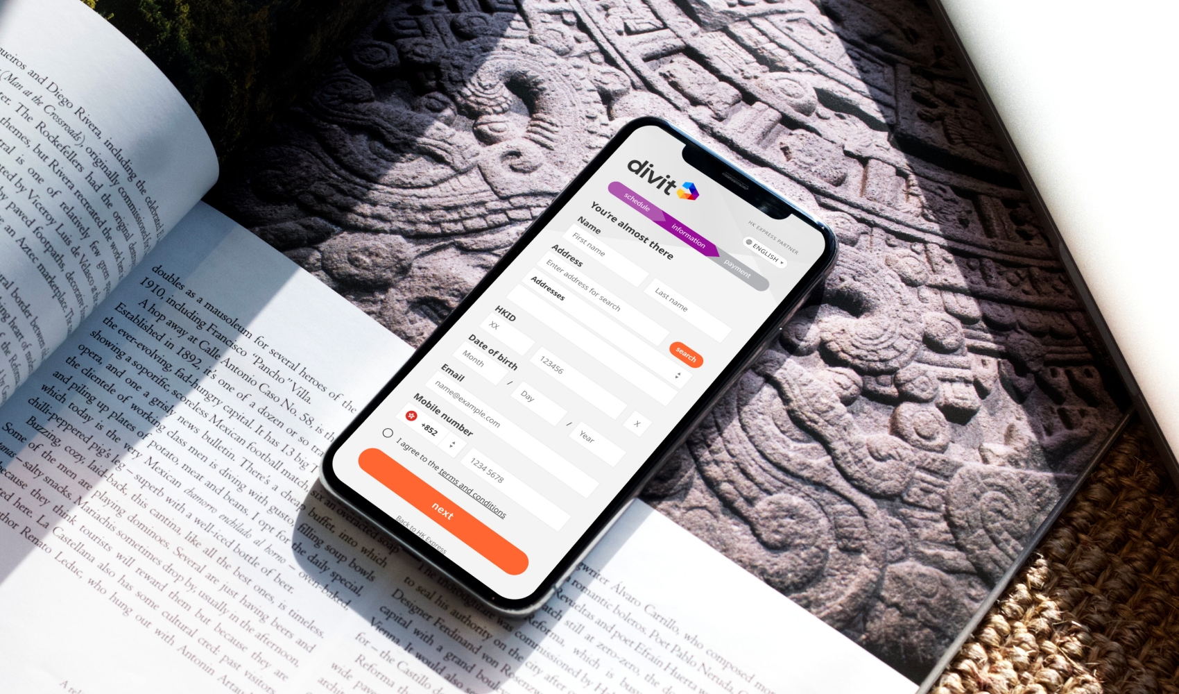
The main challenge was the product needing to balance high information requirements necessary when providing airline and banking services (eg address, ID verification, payment details and frequency and amount of part payments) and keeping the check-out process as quick as simple as possible.
While divit had formulated other generic objectives, such as the product being widely accessible, intuitive to use and appealing in design, no user research had been conducted to define their target market and derive more specific product requirements.
GUERRILLA RESEARCH:
Needing a fast and low-cost way to learn about potential user groups and product requirements, to which we decided on a two-pronged guerrilla research approach.
Target market:
We reviewed existing research on part-payment and ‘buy now, pay later’ (BNPL) products, which indicated that quick adopters of such services were digitally native young adults between 18 and 30 years of age. However, we did not know whether this assumption would apply to the market for airline tickets specifically.
Product requirements:
We wanted to gather some user specific requirements and features that would make the product easy to use.
We created a simple survey accompanied by a basic prototype of the product and distributed it to willing participants in Hong Kong.
PROBLEMS SOLVED
Interestingly, we found that younger people were rather skeptical towards debt and BNPL products. Instead, professionals between 30 and 45 years of age who travel frequently were more likely to use the payment platform.
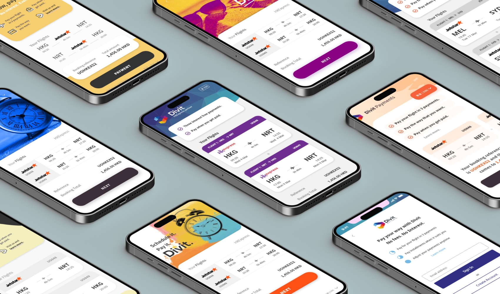
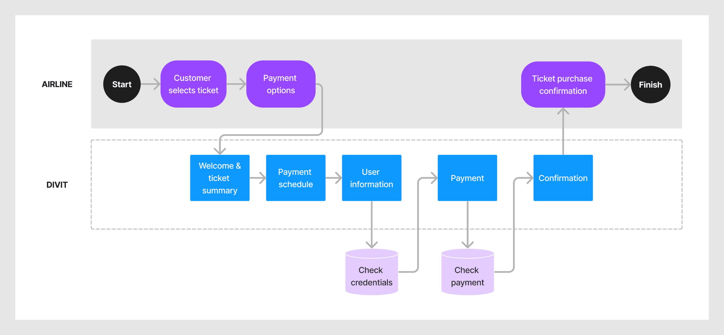
We needed to make sure that users felt in control throughout the entire check-out process. Our research had shown that users lost trust when they were diverted away from the ticket booking website to the payment platform. Users feared that their selected ticket and price would be affected by this. We addressed this by:
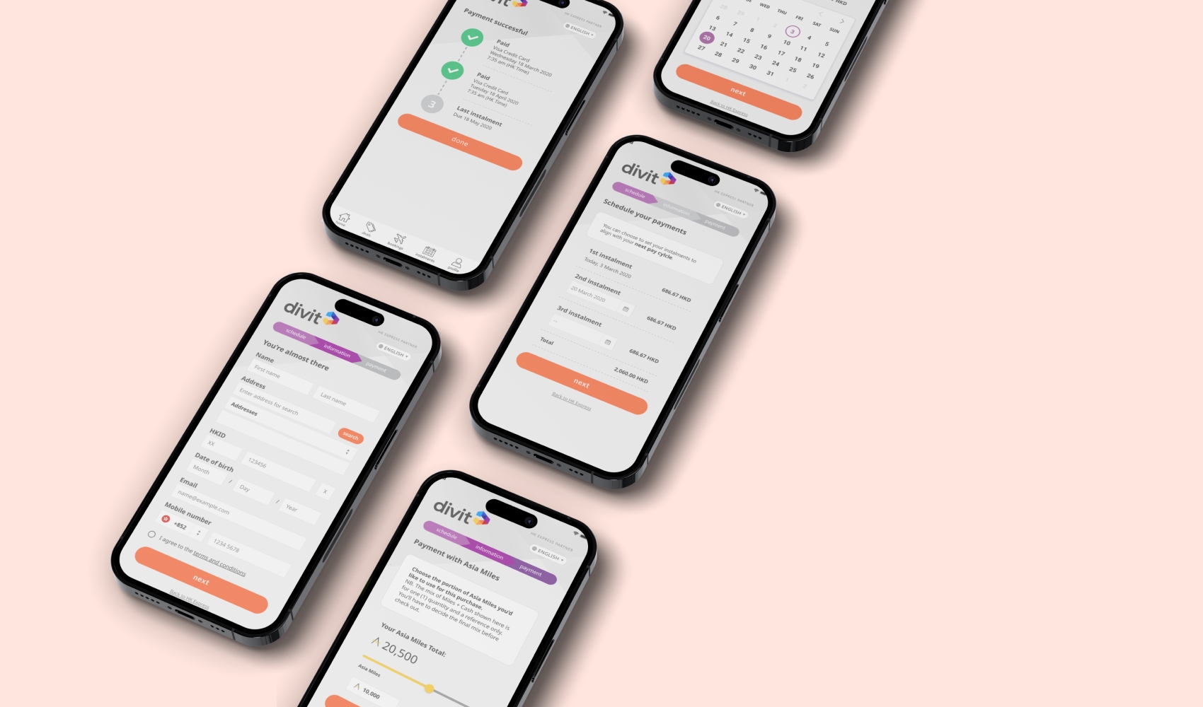
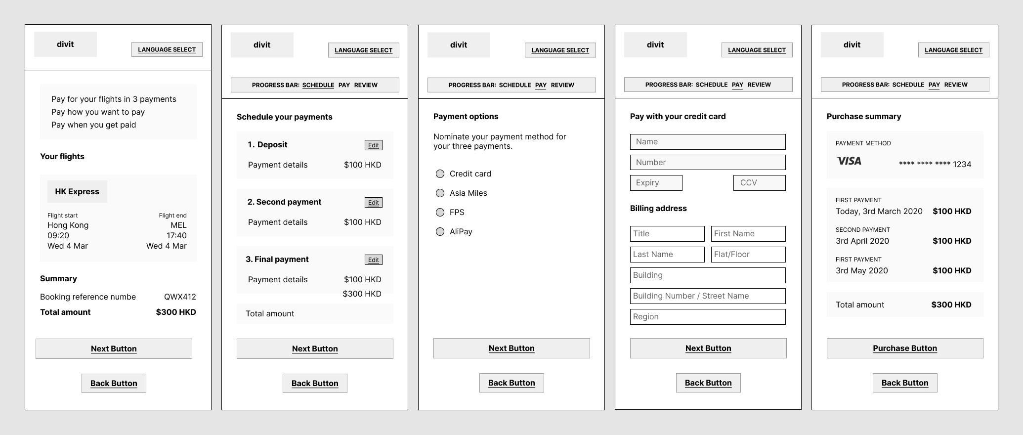
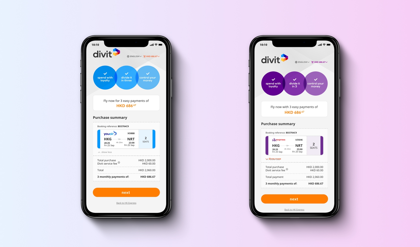
- Implementing a theme-able design that displayed the chosen airline’s branding and logo throughout the payment process.
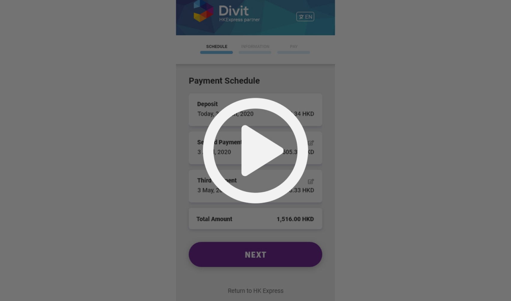
- Displaying a summary of the ticket information on the payment configuration page as well as the payment summary page.
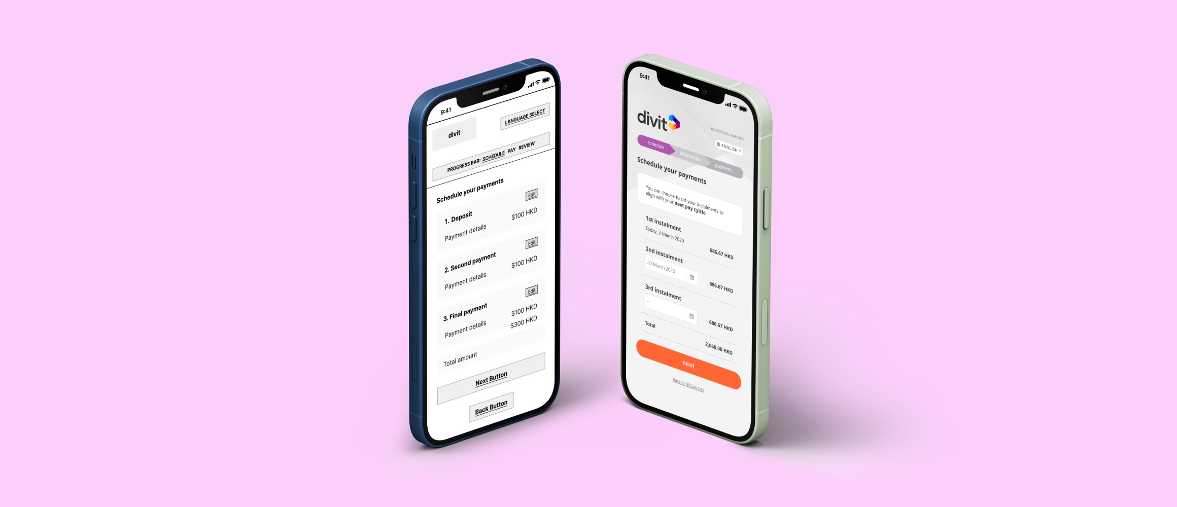
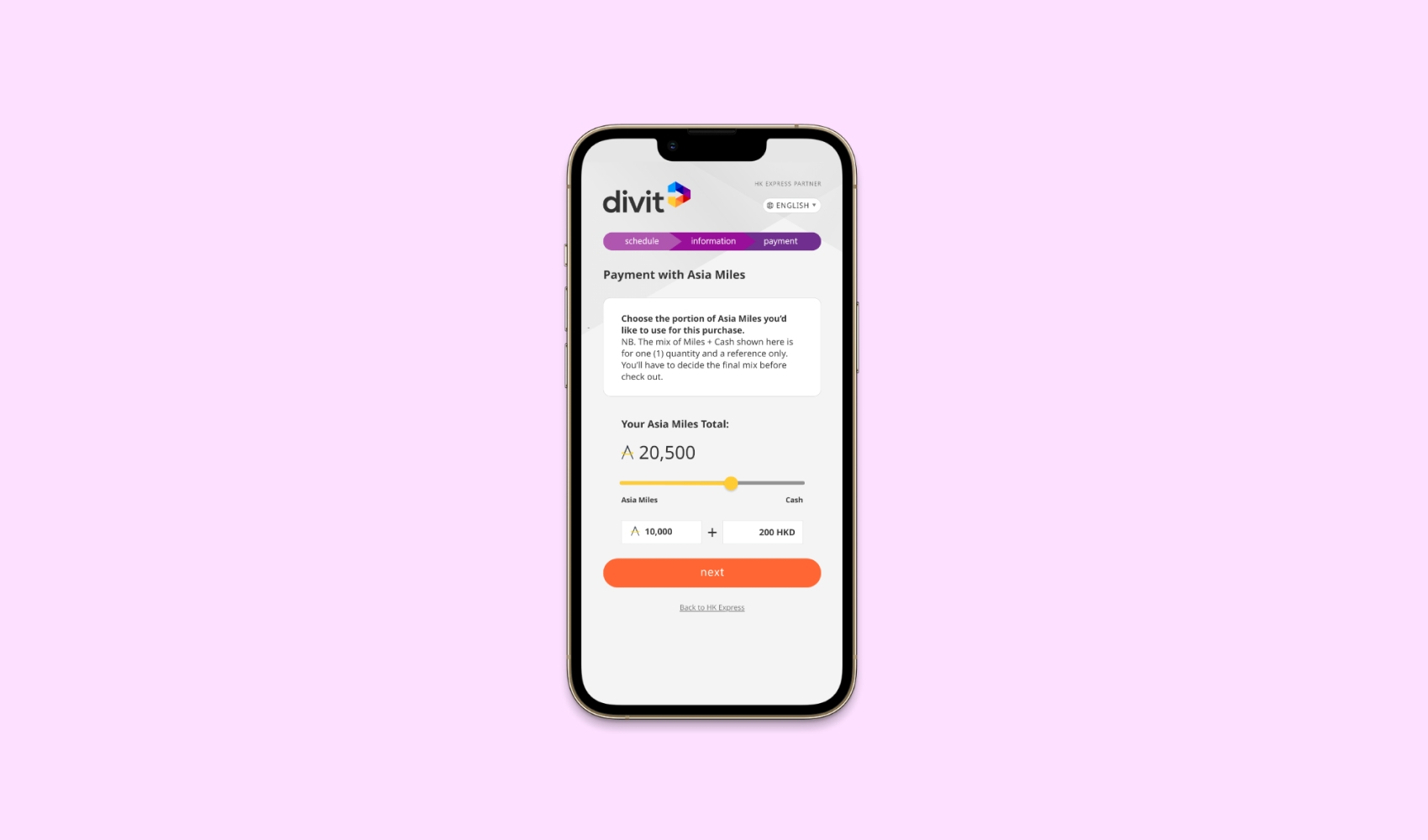
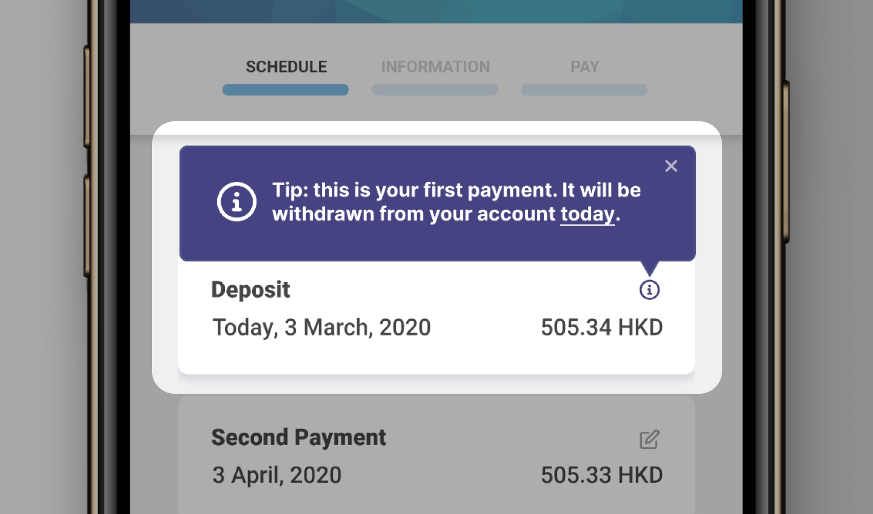
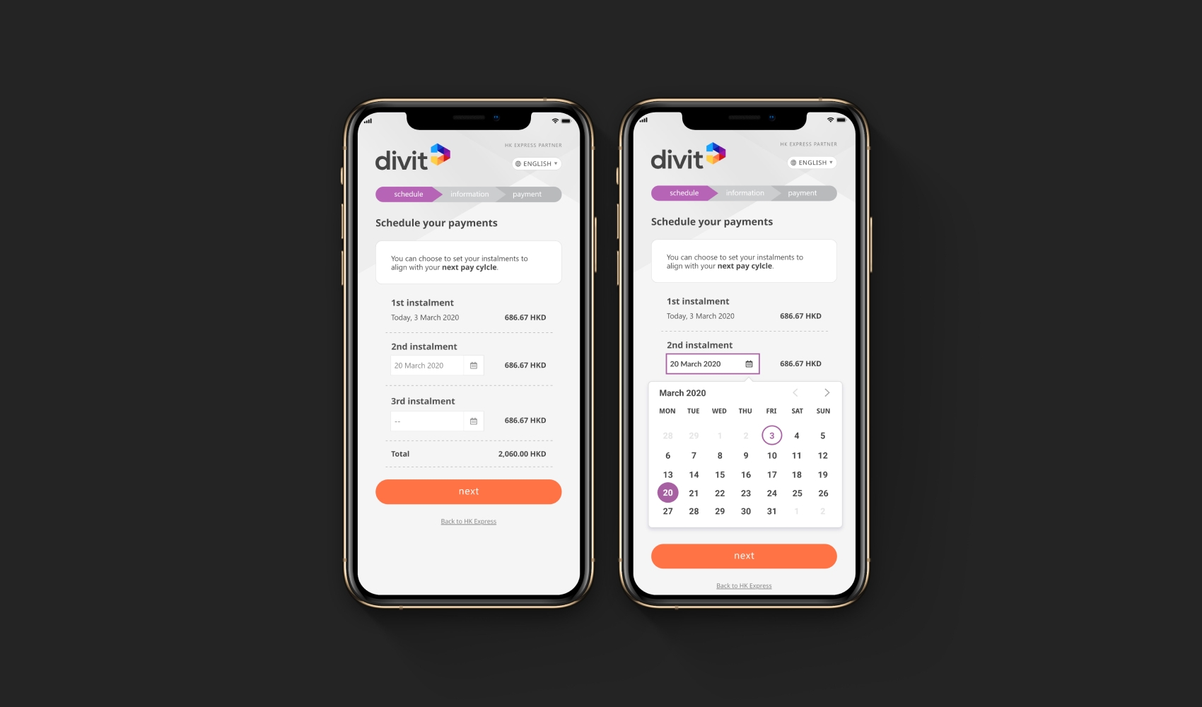
Our research indicated that users wanted a high level of flexibility over timing and amount of part-payment instalments, as salary payment periods and payment preferences differed widely in Hong Kong. We solved this by adding a calendar component that was highly customisable, yet clear in communicating options and consequences.
A challenge was balancing financial services business requirements and creating a product that was not overloaded and easy-to-use for customers with varying levels of experience using BNPL products. We designed the web app to include only necessary information based on the needs of more experienced users. To provide the option for more information, we added tool tips for each step in the check-out process. We put an emphasis on using plain language.
OUTCOMES AND ACHIEVEMENTS
- Two major airlines immediately signed up when approached with the web app prototype.
- Early user sign-ups were much higher than expected.
- Investments for development of web app were secured.
- Finished product is now live and a rewards system was added later.
RESPONSIBILITIES
I worked on this project as the Lead designer and Developer.
My main areas of responsibility:
- UX (prototype, derived product requirements from research)
- Design (branding, lo-fi and hi-fi for web app and website, component library)
- Front-end development (website and web app)
- Management & leadership (technical scoping, sprint planning, business strategy meetings, onboarding another designer)